
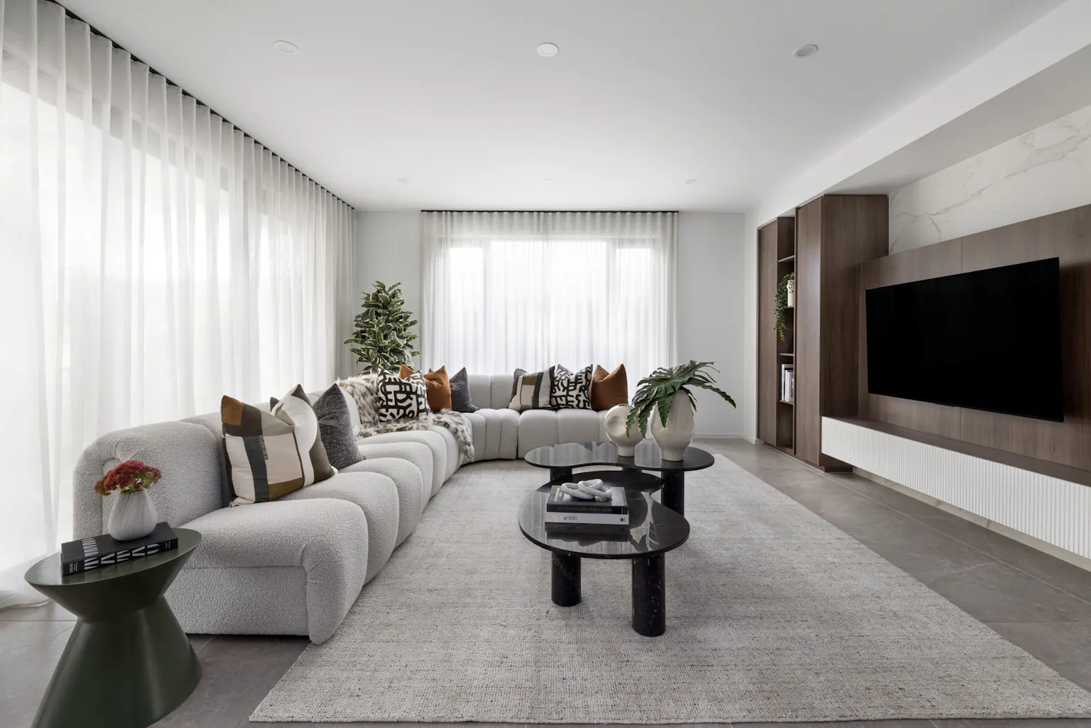
At Bankside Estate in Rowville, Metricon's two neighbouring display homes offer a compelling study in contrast - not just in finishes and furnishings, but in mood, movement and emotion.
The Vantage 48 is a lesson in lightness. Think soft tones, tactile layers, and a calm, effortless mood. Just next door, the Hampshire 50 takes a bolder route, with deeper hues, rich textures and a nod to Mid-Century cool.
Together, they reveal just how powerful interior choices can be. In conversation with Senior Interior Designer Nicole Boeyen, we explore how both homes came to life - and how you can use a similar approach to build a home that truly reflects you.


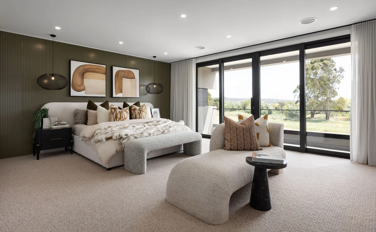
The Vantage – Light, Textural, Effortless
The design story of the Vantage began with a single, textured tile - soft in tone and subtle in form - that became the anchor for the entire palette. Senior Interior Designer Nicole Boeyen explains:
“Initially it was the shape that stood out to me - it echoed the arch motifs that were already in the home. But it was the colours in the tile that really set the foundation for everything else.”
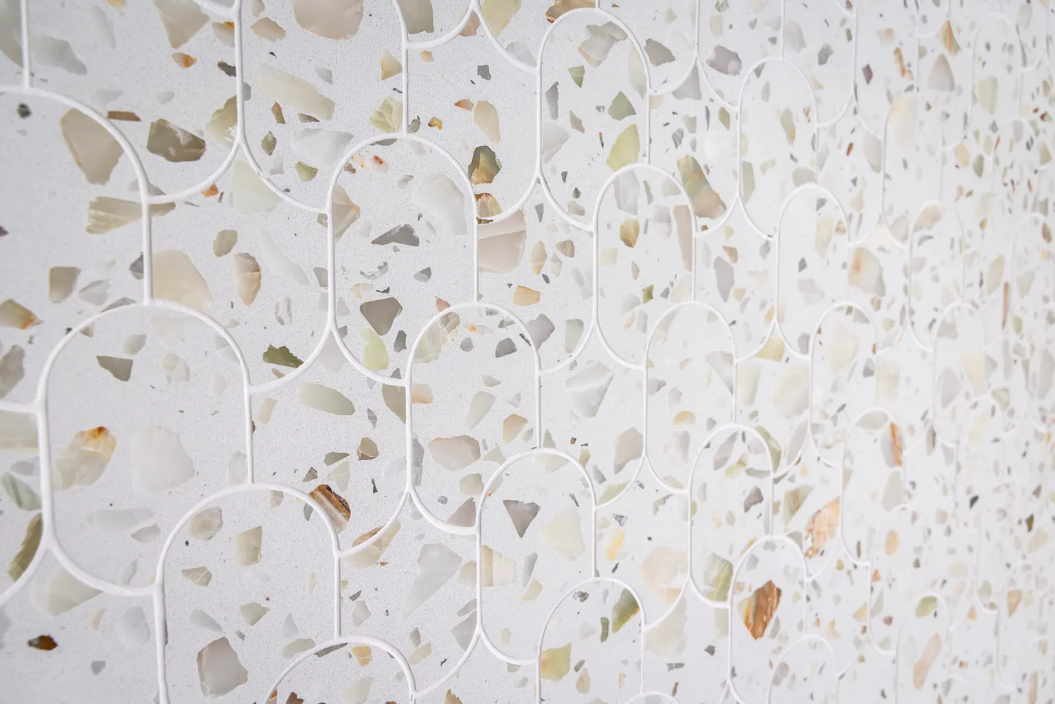
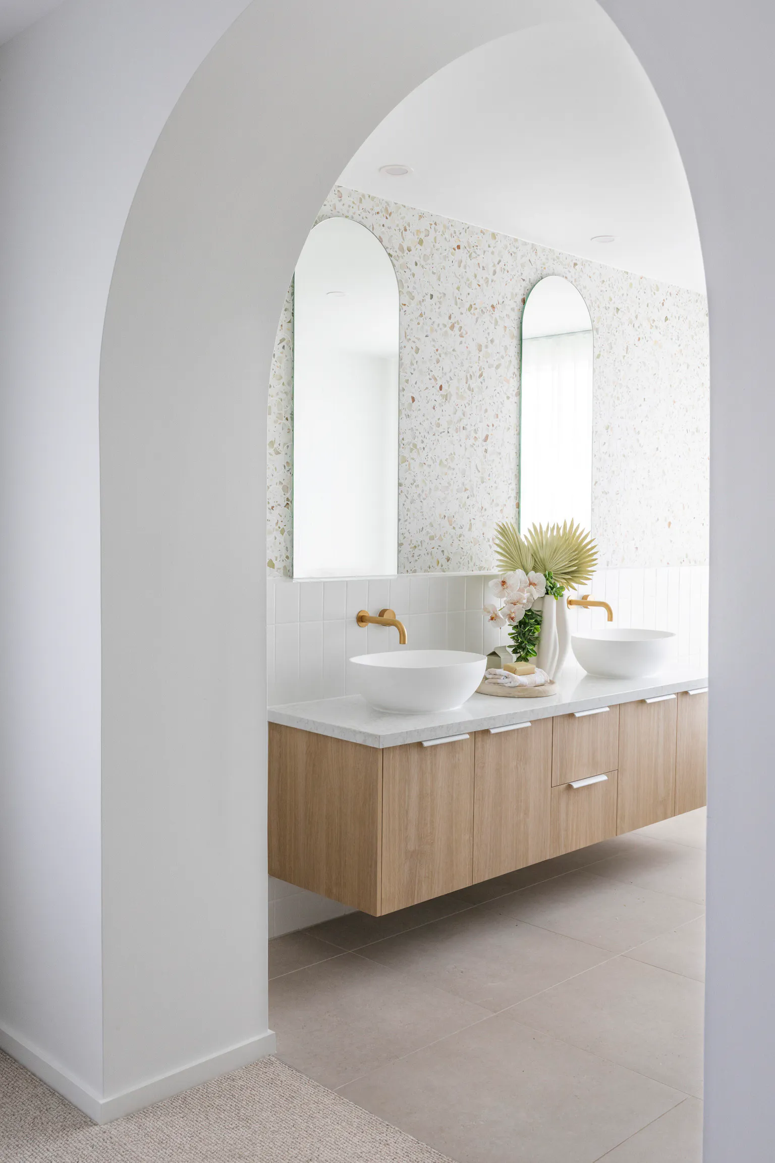
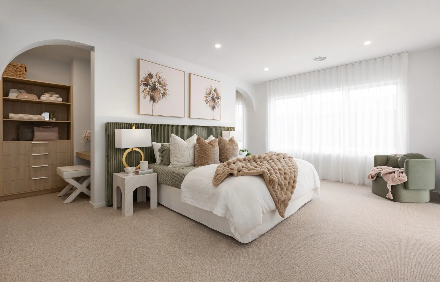
From that starting point, Nicole built a tonal, organic scheme layered with oak timber, brushed brass, soft grey-greens and velvet accents. The result is a home that feels open, textural and quietly luxurious - the kind of space that draws you in without needing to shout.
“All the colours, from the hard finishes to the soft furnishings, are muted and tonal. The eye can move around the room without interruption - nothing is jarring,” she says. “It creates this really calming flow.”
Texture plays a starring role in keeping the space warm and grounded. Timber flooring and loop pile carpets bring in that necessary softness underfoot, while gentle fabrics and tactile surfaces give each room depth without heaviness.
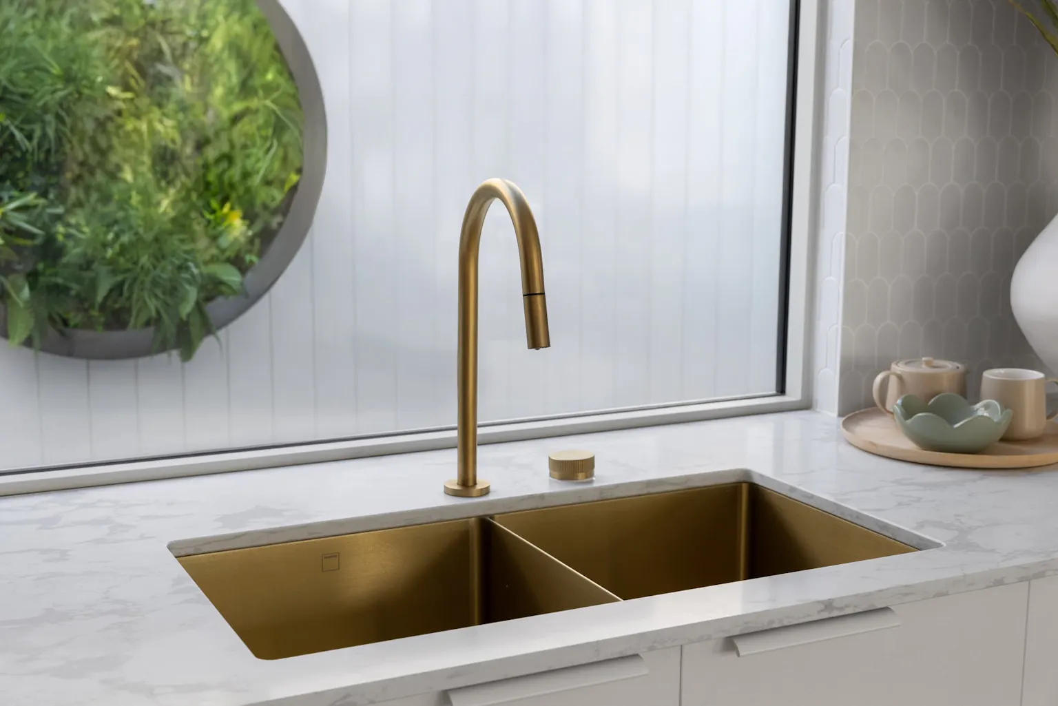
The kitchen becomes a true centrepiece, anchored by Zenith Bescato Bianco benchtops from Stone Ambassador, which elevate the space with their subtle veining and luminous surface. These benchtops not only complement the tonal palette but also play a big part in bringing the kitchen to life, adding both refinement and durability to the heart of the home.
“It’s that balance between softness and structure. Layering textures is key, but it’s also about restraint - letting the palette breathe.” Nicole Boeyen
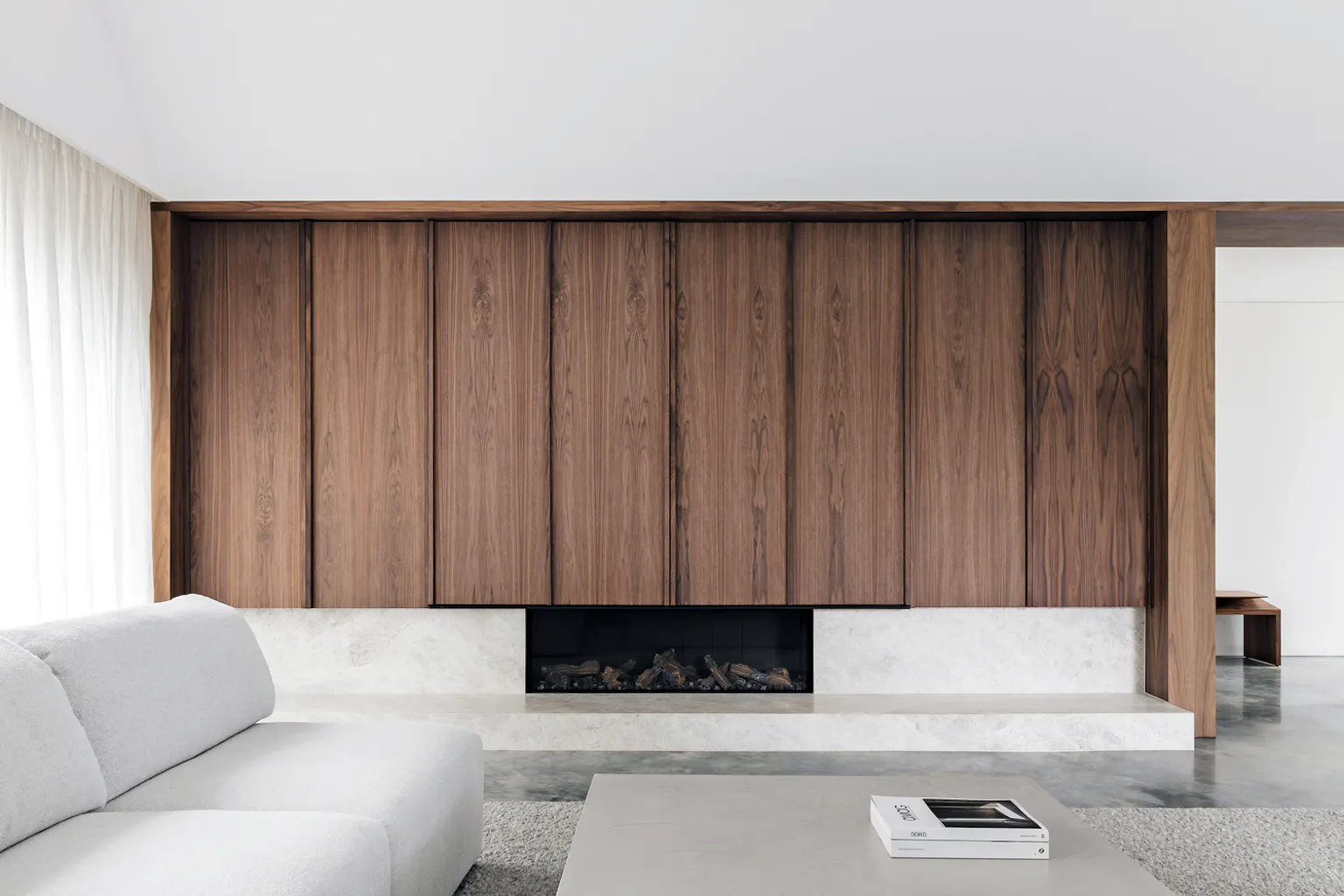
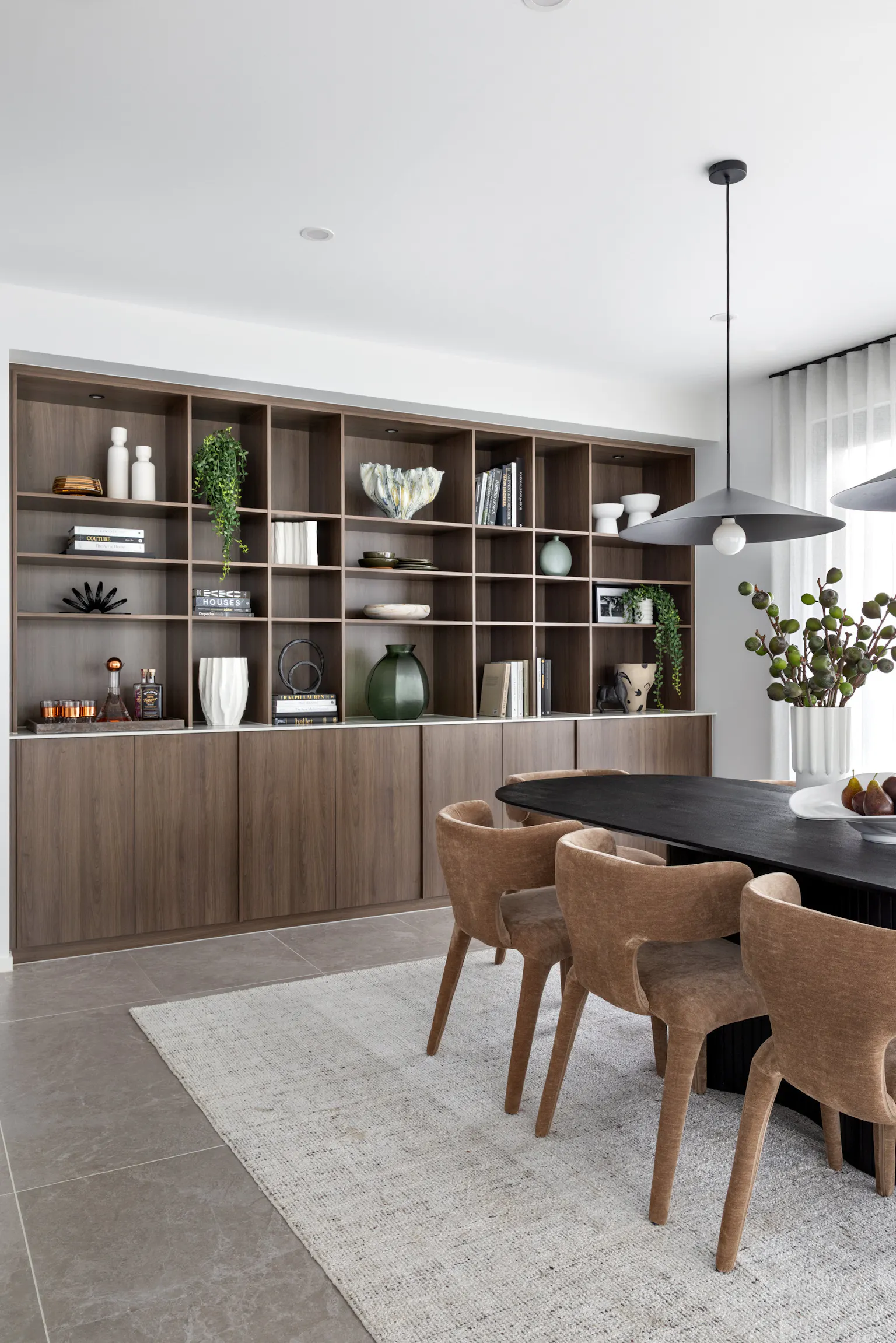
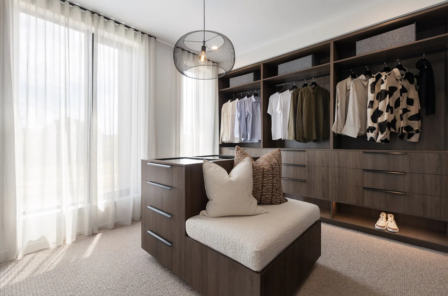
The Hampshire 50 – Bold, Tonal, Confident
Where the Vantage leans into lightness, the Hampshire 50 takes a more grounded approach. This home embraces richer tones, walnut cabinetry, and tonal contrasts, with subtle references to Mid-Century modern styling - minus the teak. The mood is confident, tactile and considered.
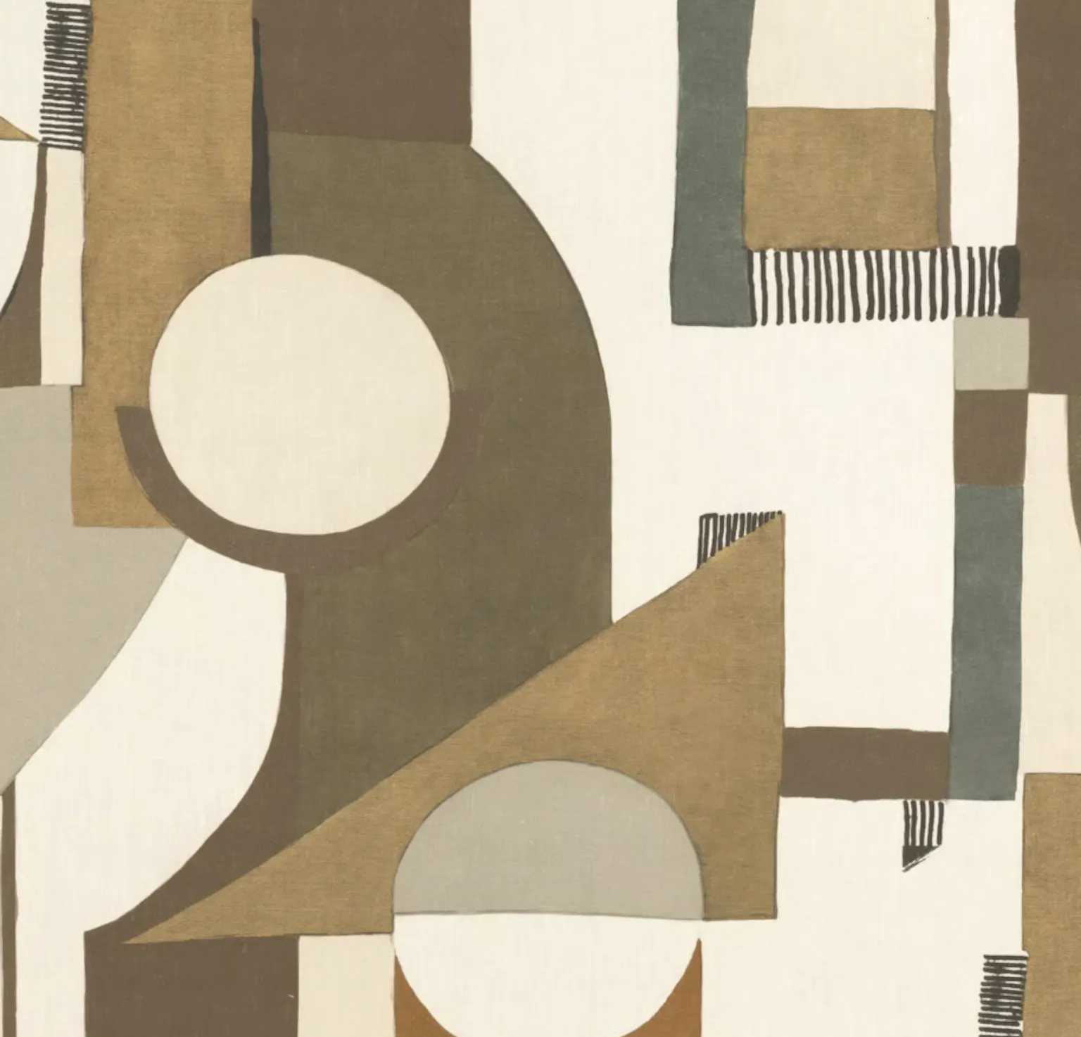
“It actually started with a photo I found on Pinterest from Adam Kane Architects,” says Nicole. “There was a detail in the cabinetry - this protruding section between cupboards - that caught my eye. From there, our incredible joinery designer Katia Slogrove developed what you see now in the Hampshire.”
A single piece of fabric from James Dunlop sealed the direction. With its sculptural shapes and 1970s-inspired palette, the textile helped set the tone for the entire home - its warmth, its richness, and its subtle retro energy.
But richness doesn’t mean heavy. While the cabinetry and wall colours are deep and dramatic, they’re balanced with light flooring, warm-toned furnishings and tactile elements that keep the home feeling open and inviting.
“We worked with a lot of contrast. There are bold materials throughout, but we used soft carpets, artwork, wallpaper and layered fabrics to bring in warmth and lightness.” Nicole Boeyen
Green tones appear throughout - in the feature walls and even the wallpaper - echoing elements from that original fabric swatch. And while the palette is moody, it never tips into cold or oppressive.
“Darker tones can feel incredibly luxurious, but they need texture and softness to really work,” Nicole says. “We used beautiful Dekton surfaces in a matte off-white, and silk-finish floor tiles that reflect just enough light to lift the space.”
Nicole’s Take: Start with One Thing You Love
Whether you gravitate toward calming neutrals or a more confident palette, Nicole’s approach to designing a cohesive interior remains the same: begin with a single element that genuinely resonates.
“Start with one thing that speaks to you - it could be a tile, a benchtop, a fabric, even just an image you’ve saved,” she says. “Let that be your anchor. From there, it’s all about layering tone, texture and contrast.”
It’s a method that’s as intuitive as it is effective. On both the Vantage and the Hampshire, a single spark - whether a textured tile or a piece of fabric - informed every decision that followed, creating homes that feel deliberate, balanced, and beautifully personal.
So, where should someone begin if they’re unsure of their style?
“Pinterest is your best friend,” Nicole suggests. “Start a board, save what you’re drawn to, and then step back. You’ll start to notice a pattern - shapes, colours, materials. That’s your style starting to take shape.”
As for ensuring cohesion throughout the home, Nicole’s advice is simple: be consistent with your elements, but don’t be afraid to tell your story.
“Your home should reflect who you are. The places you’ve travelled, the things you love. Design choices become more powerful when they’re personal.”
Visit Bankside Estate in Rowville to experience both homes side by side - from the breezy calm of the Vantage to the bold, curated confidence of the Hampshire.


